Mesh App Redesign
The original app was outdated and some of the flows need to be redefined. My task was to craft a smoother flow that helps users simplify the navigation of the application as best as possible.
My Role
- UX/UI design

Identified Problem
Unfortunately, there are no enough source and device samples for usability tests. I had to approach the user research differently to determine the problem. I have discovered that I could use user reviews in the app store. After read through all the reviews, I clustered these data and narrowed down to three groups.

User Reviews
42%
35%
Software Error
Confused Flow
24%
Outdated UI
1. Software error: endless loading, failed to received account verification email
Most users complaint were they didn't receive an account confirmation email. Or they got stuck on certain pages with an endless spinning icon. As a result, they are having a hard time to proceed further.
2. Cluttered and confused flow structure
Users unable to get to the dashboard, they kept going to the "Let's get started" page. Also, missing instruction frustrating users, and they probably give up in the early process.
3. Outdated & clumsy UI
Clumsy and outdated UI definitely effects overall user experience.
Discover & Define
I got three Askey mesh samples, and then I spent some time explored the product and tried to set up in my apartment. The following are my test tool, location, subject, and time.
Test phone: Android 8

Apartment size: 427 Sq ft

Mesh device:
3 Nodes

Test time:
2 hrs
Heuristic Evaluation
I decided to use Heuristic evaluation from Jakob Nielsen’s 10 principles of user interface design. The evaluation is marked with a severity scale of 1~5. The result as follows:
2
Visibility of system status
2
Recognition rather than recall
2
Match between system and the real world
2
Flexibility and efficiency of use
3
User control and freedom
3
Aesthetic and minimalist design
1
Error prevention
2
Help users recognize, diagnose, and recover from errors
1
Consistency and standards
2
Help and documentation
Evaluation Finding

Error prevention
The user may accidentally tap
input field when try to tap next icon.
Visibility of system status
Next button is lack of hierarchy. The button doesn't serve purpose correctly.

Match between system and the real world
This icon is well-known as add action, but this icon is not standard symbol as re-arrangement. User can’t understand why it was used.

Consistency and standards
Duplicate function button
Error prevention
It gets difficult to understand whether
the toggle is showing state or action.
Users are not able to immediately switch to different mode. Parental control settings require toggle off and then toggle on to show selection.
User control and freedom

Consistency and standards

Help users recognize, diagnose, and recover from errors
Duplicating and overload information, the users may consciously or
unconsciously ignore it.
Same function but in different style and color.
Original Installation Flow
During my journey to explore the app, I have discovered why some users kept going to the “Let’s get started” page. Look at the original flow and you will see a misleading route. The app will redirect the users back to the first page without showing a failed result.

Redesign Installation Flow
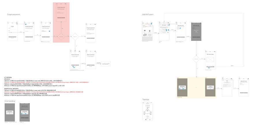
As propose below, I added set up result and tips page to the flow. The user flow become much smoother after this change. Users no longer stuck in the installation process, they will be informed if completed the set up or not. When they failed, they can follow the tips and simply tap try again button without go through entire flow again.

1
Wireframe


UI Elements
Font
San Francisco

Light

Regular

Medium
Color
After
Before
Poor scalability on the small platform
Able to view in different sizes platform

A
+
=
+

Before
After
Clear input shortcut
Increase button size

Small button
Missing password hint
Password hint
After
Before
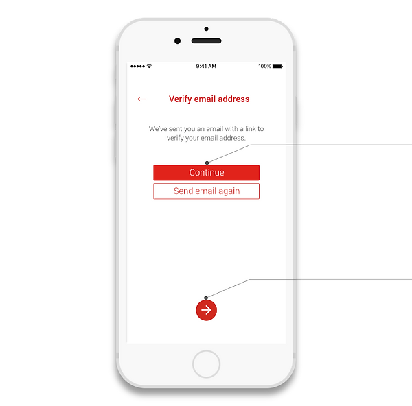
Too many buttons
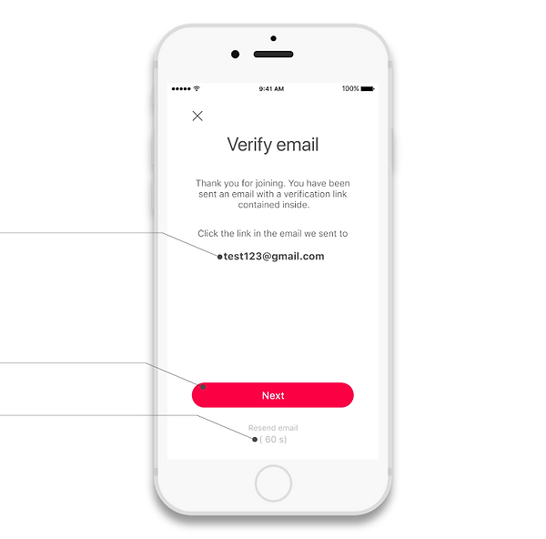
Missing email info
Show email
Refine button
Add count down for
resent email

Before
Compelling visual hierarchy
After

Chunky style
Illustration


